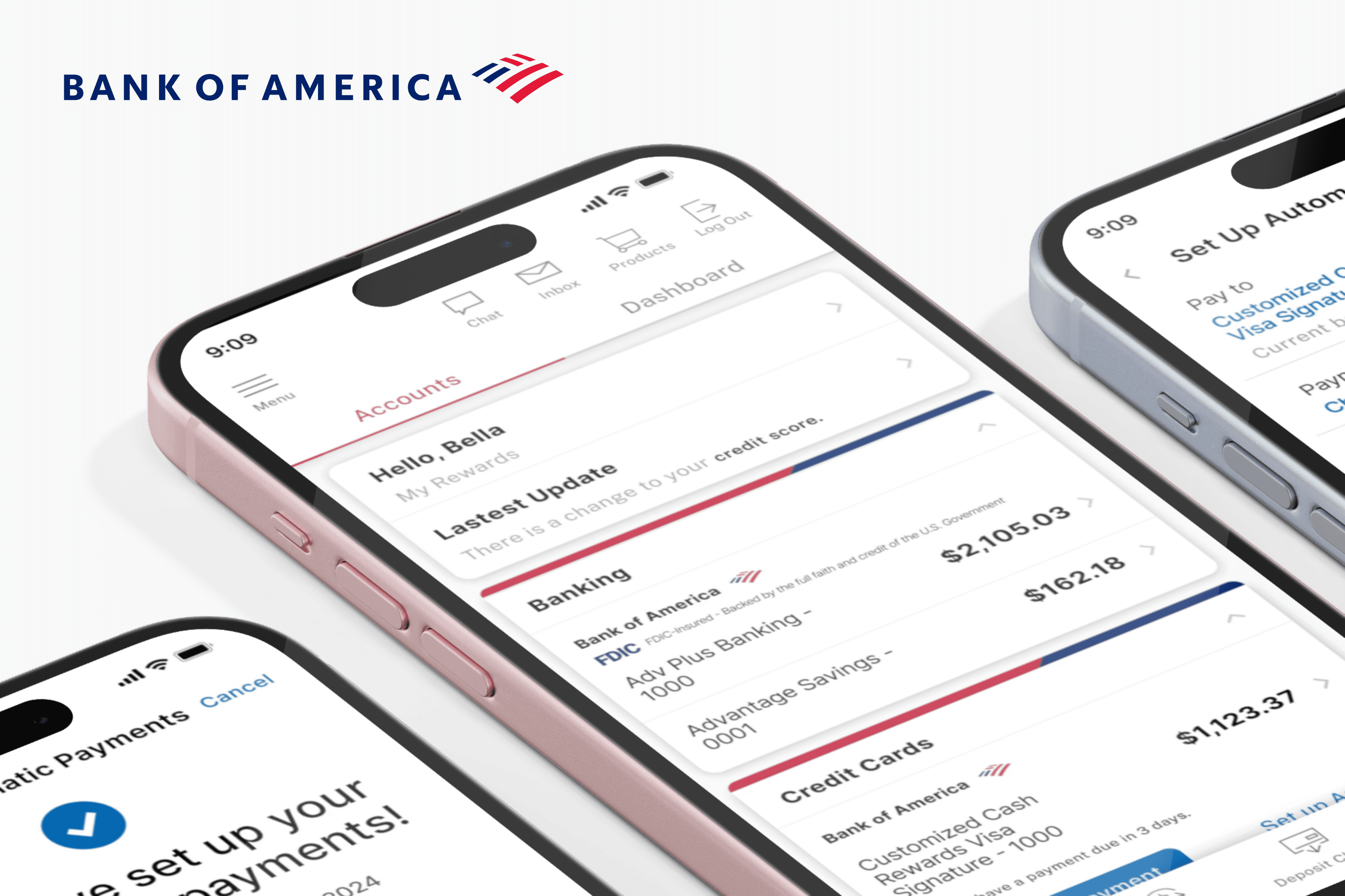
Bank of America: Auto-Pay Redesign
Bank of America: Auto-Pay Redesign
Role
Role
UX Designer & Researcher
UX Designer & Researcher
Team
Team
Individual
Individual
Date
Date
October 2024
October 2024
Duration
Duration
1 Week
1 Week
Why I Redesigned Bank of America's Auto Pay Feature

It all started when my mom asked for help setting up Auto Pay in her Bank of America app—she couldn’t find where it was. I assumed it would be quick to guide her, but to my surprise, I couldn’t locate it either. That moment made me wonder: If both of us—representing different age groups and tech comfort levels—struggled to find this feature, how many others face the same issue?
It all started when my mom asked for help setting up Auto Pay in her Bank of America app—she couldn’t find where it was. I assumed it would be quick to guide her, but to my surprise, I couldn’t locate it either. That moment made me wonder: If both of us—representing different age groups and tech comfort levels—struggled to find this feature, how many others face the same issue?
It all started when my mom asked for help setting up Auto Pay in her Bank of America app—she couldn’t find where it was. I assumed it would be quick to guide her, but to my surprise, I couldn’t locate it either. That moment made me wonder: If both of us—representing different age groups and tech comfort levels—struggled to find this feature, how many others face the same issue?
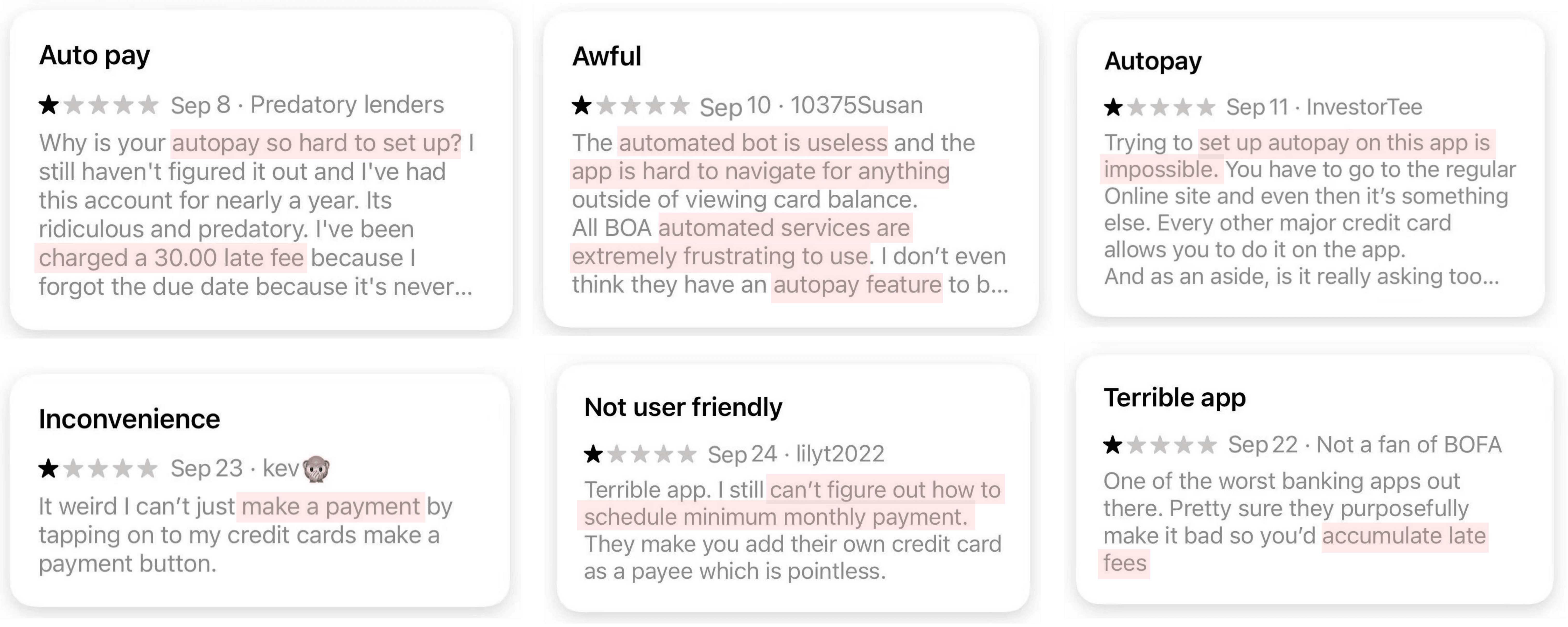
Curious, I turned to the App Store and started reviewing user feedback. To understand the user's experience and feedback, l extracted 120 user reviews of Bank of America from the Apple store. The reviews are from 2022 to 2024, including one-star to five-star reviews. Sure enough, I found over 55% in 1 to 2 stars review complaints about how hard the Auto Payment function was to find, set up, or trust the Auto Pay function.
This experience sparked my motivation to rethink and redesign the Auto Pay flow—making it more intuitive, transparent, and user-friendly for everyone.
What’s Broken — And What I Set Out to Fix

User Pain Points
Through both personal experience and App Store research, I identified several recurring pain points in the current Auto Pay feature:
User Pain Points
Through both personal experience and App Store research, I identified several recurring pain points in the current Auto Pay feature:
User Pain Points
Through both personal experience and App Store research, I identified several recurring pain points in the current Auto Pay feature:
Hard to Find: Users often can’t locate the Auto Pay setup in the app’s navigation.
Unclear Setup Process: Steps feel disjointed, with no guidance or confirmation.
Lack of Flexibility: Users can’t easily adjust payment amounts, dates, or rules.
No Feedback or Control: There's limited communication around when or how payments are processed—and manual payments sometimes cause accidental duplicates.
My Design Goals
To address these issues, I set out to redesign the Auto Pay experience with the following goals:
My Design Goals
To address these issues, I set out to redesign the Auto Pay experience with the following goals:
My Design Goals
To address these issues, I set out to redesign the Auto Pay experience with the following goals:

Make It Discoverable – Clear entry points from the dashboard.
Guide Users Step-by-Step – A simple, structured flow to build confidence.
Put Users in Control – Options to customize payment amount, date, cancellation and notification.
Communicate Clearly – Timely confirmations, alerts, and easy access to edit or cancel.
Create a Consistent Experience – Uniform design language and keep current brand identity include its color palette, typography, and overall visual style.
Challenges I Faced

1. Limited Time & Budget
This was a solo project with no budget and limited availability—both mine and the participants’.
How I solved this:
I worked around this by reaching out to friends, LinkedIn contacts, and Reddit users, asking if they’d be open to participating during their free time, even across time zones.

2. Mostly Remote Interviews
Most of the interviews were done virtually, which made it harder to observe body language or hesitation during task flows.
How I solved this:
I asked participants to talk through their actions out loud and used follow-up questions to clarify their thought process.
2. Mostly Remote Interviews
Most of the interviews were done virtually, which made it harder to observe body language or hesitation during task flows.
How I solved this:
I asked participants to talk through their actions out loud and used follow-up questions to clarify their thought process.
2. Mostly Remote Interviews
Most of the interviews were done virtually, which made it harder to observe body language or hesitation during task flows.
How I solved this:
I asked participants to talk through their actions out loud and used follow-up questions to clarify their thought process.
User Interview

Based on insights gathered from user reviews, I developed more targeted interview questions to help participants share detailed experiences and identify specific usability issues. I interviewed 8 participants. Here's what I found:
Based on insights gathered from user reviews, I developed more targeted interview questions to help participants share detailed experiences and identify specific usability issues. I interviewed 8 participants. Here's what I found:
Hard to Find: 6 out of 8 users struggled to locate the Auto Pay option.
Low Confidence After Setup: Visual confirmation was unclear or absent, leaving 5 participants feeling uncertain.
Manual Payment Confusion: 3 users experienced issues where they made a manual payment, yet were still charged automatically.
Lack of Guidance: Users described the process as “unclear” and “disconnected”.
What Users Want: Participants asked for clearer labels, step-by-step guidance, and a confirmation screen that states when Auto Pay will start and what it covers.
User Persona
#bill payer
#tech curious
#frustrated by apps
Linda Chen
AGE
AGE
JOB TITLE
JOB TITLE
STATUS
STATUS
LOCATION
LOCATION
55
55
Primary School Teacher
Primary School Teacher
Married
Married
Orange, CA
Orange, CA
“I just want to set it and forget it—I shouldn’t need help every month to pay my bills.”
“I just want to set it and forget it—I shouldn’t need help every month to pay my bills.”
ABOUT
Linda is a responsible, detail-oriented primary school teacher who handles household finances. While she uses mobile apps for everyday banking, she often feels overwhelmed by complicated interfaces.
Recently, she tried setting up Auto Pay in her Bank of America app but couldn't find the option—so she asked her daughter for help. When both of them struggled, she realized the issue wasn't just her.
Linda is a responsible, detail-oriented retiree who handles household finances for herself and her husband. While she uses mobile apps for everyday banking, she often feels overwhelmed by complicated interfaces.
Recently, she tried setting up Auto Pay in her Bank of America app but couldn't find the option—so she asked her daughter for help. When both of them struggled, she realized the issue wasn't just her.
GOALS
Set up recurring payments for credit cards and utilities
Avoid late fees by automating bills
Have confidence that payments will go through without issues
KNOWN HABITS
Checks her bank app weekly to monitor balances
Avoids using desktop banking; prefers mobile for convenience
Often asks family members for tech help when she gets stuck
PAIN POINTS
Can't easily find the Auto Pay feature in the app
No confirmation that recurring payments were set correctly
Confused when manual payments still trigger Auto Pay
Feels unsure whether changes are saved properly
FAVORITE BRANDS


PREFERENCES
Mobile Banking Apps
Email Alerts
Simple Flows
Phone Support
Desktop Banking

User Journey Map (Before Redesign)
User Journey Map (Before Redesign)
User Journey Map (Before Redesign)
1. Open App: Launches BofA app
1. Open App: Launches BofA app
1. Open App: Launches BofA app
“Let me set up Auto Pay for my Credit Card.”
“Let me set up Auto Pay for my Credit Card.”
“Let me set up Auto Pay for my Credit Card.”


2. Explore Page: Searching for "Pay" button
2. Explore Page: Searching for "Pay" button
2. Explore Page: Searching for "Pay" button
“Where is this option?”
“Where is this option?”
“Where is this option?”
3. Find "Pay" Button: Tap button
3. Find "Pay" Button: Tap button
“Oh, it's here! I guess here can set up my Auto Pay.”
“Oh, it's here! I guess here can set up my Auto Pay.”

3. Find "Pay" Button: Tap button
“Oh, it's here! I guess here can set up my Auto Pay.”
4. Explore Different Options: Look for Auto Payment
“Why this only has one time payment?”
4. Explore Different Options: Look for Auto Payment
4. Explore Different Options: Look for Auto Payment
“Why this only has one time payment?”
“Why this only has one time payment?”
5. Dig deeper: Check Pay Bills under Pay & Transfer
5. Dig deeper: Check Pay Bills under Pay & Transfer
5. Dig deeper: Check Pay Bills under Pay & Transfer
“Maybe it’s hidden here?”
“Maybe it’s hidden here?”
“Maybe it’s hidden here?”
6. Give up: Quit and consider manual payment
6. Give up: Quit and consider manual payment
6. Give up: Quit and consider manual payment
“Forget it—I’ll just pay manually again.”
“Forget it—I’ll just pay manually again.”
“Forget it—I’ll just pay manually again.”
User Flow (After Redesign)

The redesigned Auto Pay user flow simplifies the experience into a clear, step-by-step process—from setup to confirmation and future management. Each touchpoint is designed to reduce confusion, improve visibility, and give users full control over their recurring payments.
The redesigned Auto Pay user flow simplifies the experience into a clear, step-by-step process—from setup to confirmation and future management. Each touchpoint is designed to reduce confusion, improve visibility, and give users full control over their recurring payments.
The redesigned Auto Pay user flow simplifies the experience into a clear, step-by-step process—from setup to confirmation and future management. Each touchpoint is designed to reduce confusion, improve visibility, and give users full control over their recurring payments.


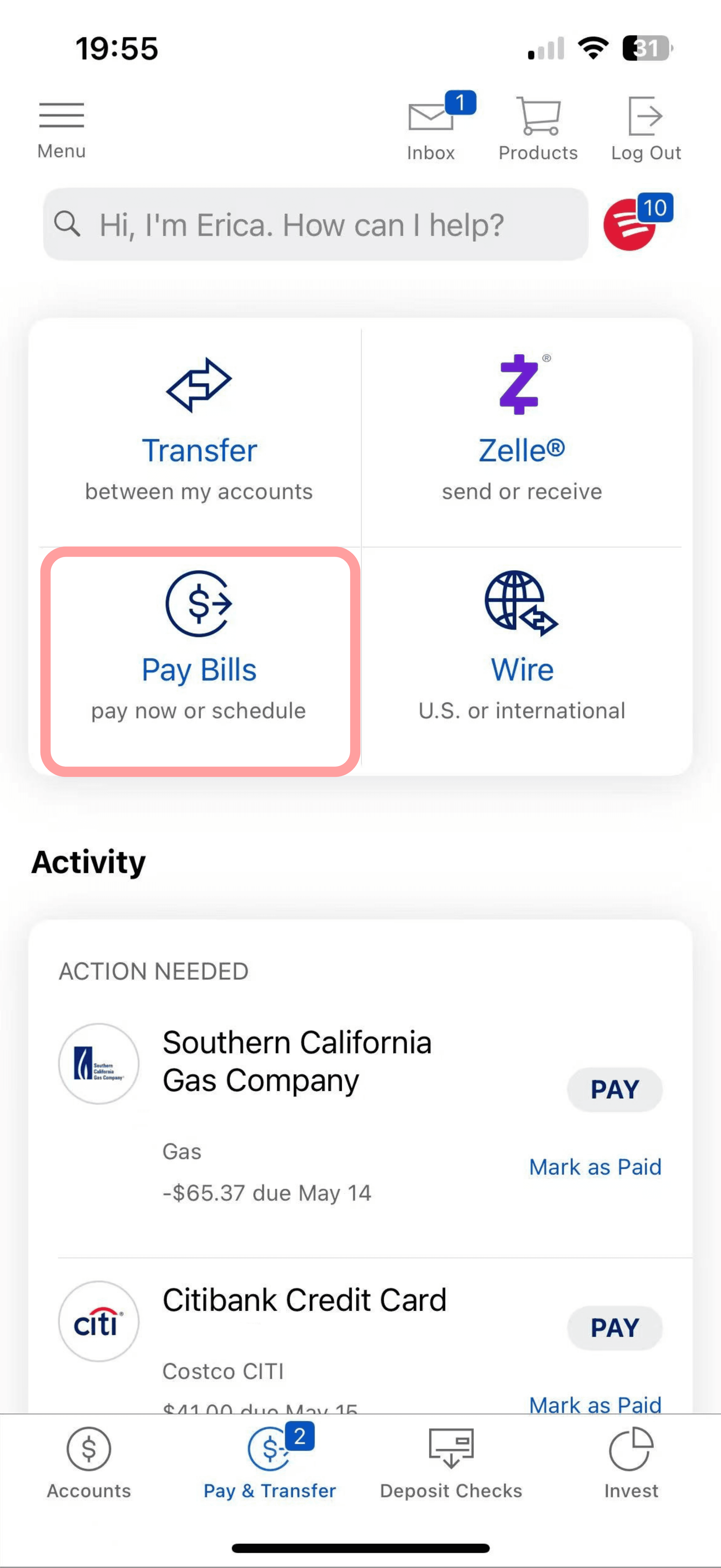
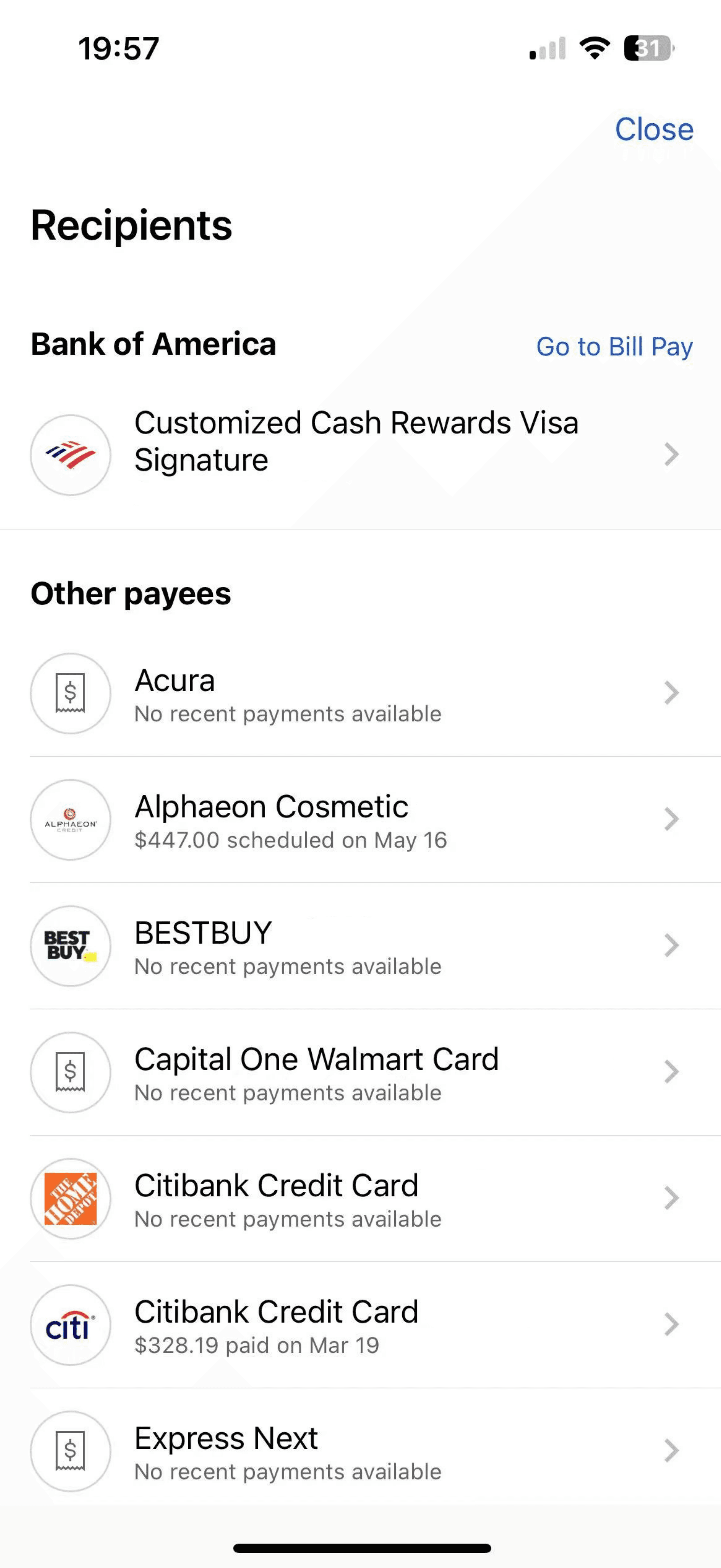
Solutions & Prototypes
Solution 1 : Homepage – Improved Clarity & Access
Overloaded & Impersonal
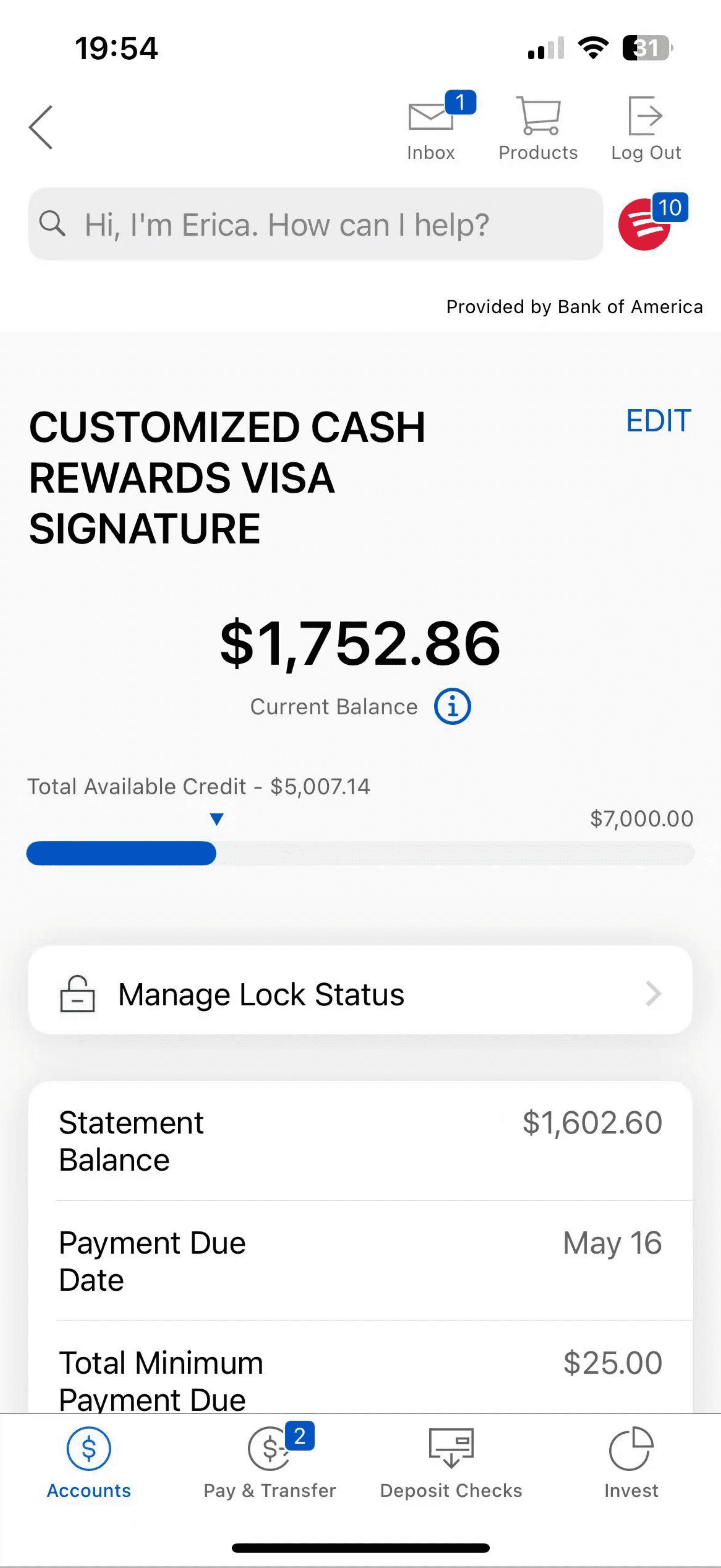
The homepage felt crowded and impersonal, with unclear hierarchy and limited actionable information. Users had to dig to find bill details or payment options, and there was no visibility into Auto Pay status.
The homepage felt crowded and impersonal, with unclear hierarchy and limited actionable information. Users had to dig to find bill details or payment options, and there was no visibility into Auto Pay status.
Before

After

Cleaner, Smarter Overview
The redesigned dashboard presents account categories more clearly, uses improved spacing, and introduces helpful updates like Auto Pay status and payment alerts directly within the credit card section. It's more personalized, readable, and actionable at a glance.
The redesigned dashboard presents account categories more clearly, uses improved spacing, and introduces helpful updates like Auto Pay status and payment alerts directly within the credit card section. It's more personalized, readable, and actionable at a glance.
Solution 2 : Set Up Payment – From Confusing to Guided
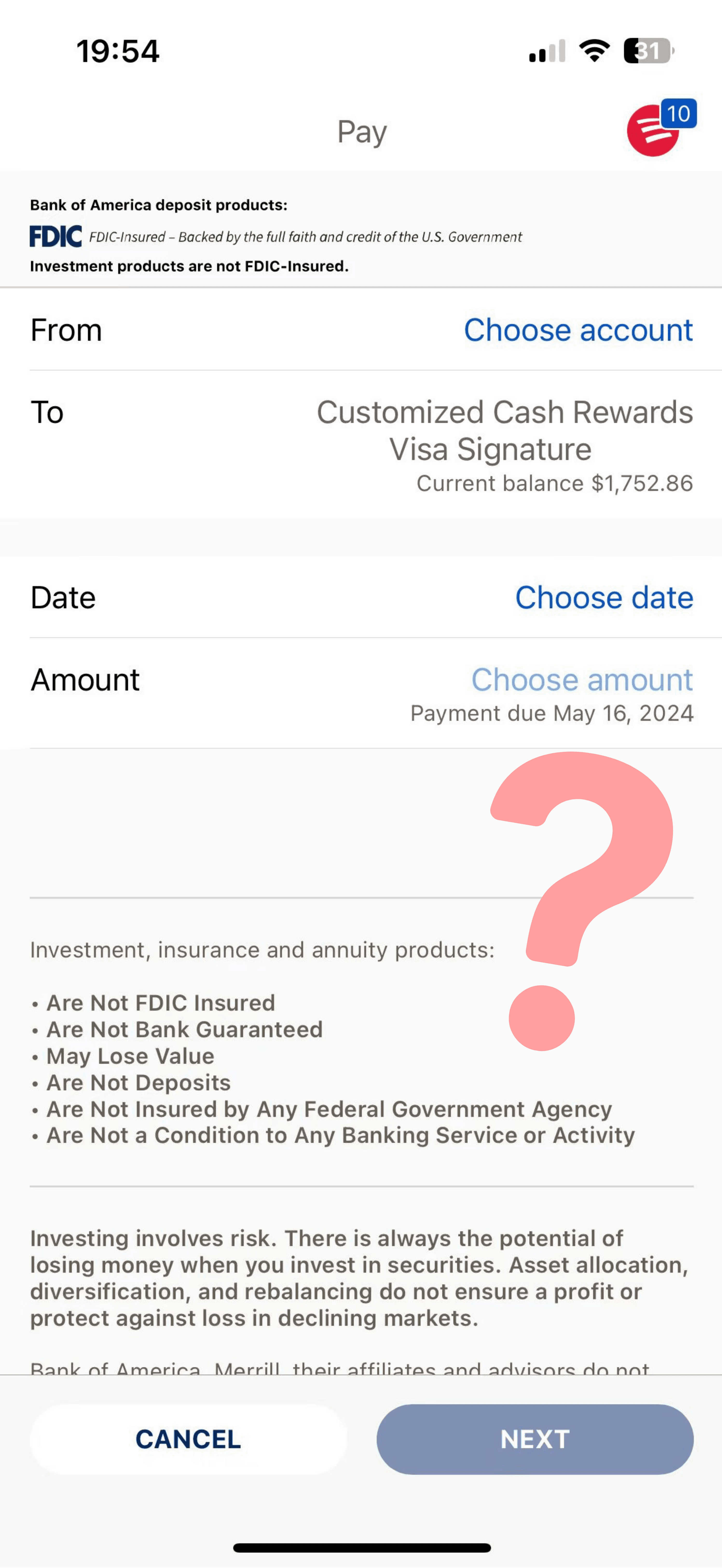
Unclear & Text-Heavy
The original setup screen was cluttered with legal text, unnecessary fonts, and no logical flow. Key inputs like payment source and amount were buried, and users had little confidence that setup was complete.
The original setup screen was cluttered with legal text, unnecessary fonts, and no logical flow. Key inputs like payment source and amount were buried, and users had little confidence that setup was complete.
Before

After

Step-by-Step & Customizable
The redesigned setup screen is clean, minimal, and guides users through Auto Pay in logical steps. It includes smart options like setting a cancel date, choosing notification preferences, and seeing real-time account balances—making it easier and more reassuring to complete the setup.
The redesigned setup screen is clean, minimal, and guides users through Auto Pay in logical steps. It includes smart options like setting a cancel date, choosing notification preferences, and seeing real-time account balances—making it easier and more reassuring to complete the setup.

Smart Setup: Pay To / From & Calendar Picker
I have improved the setup experience by making it easy to choose both the payment source and the card to pay. The redesigned calendar makes selecting a payment date intuitive, visually clear, and user-friendly; helping users confidently choose the schedule that works best for them.
I have improved the setup experience by making it easy to choose both the payment source and the card to pay. The redesigned calendar makes selecting a payment date intuitive, visually clear, and user-friendly; helping users confidently choose the schedule that works best for them.
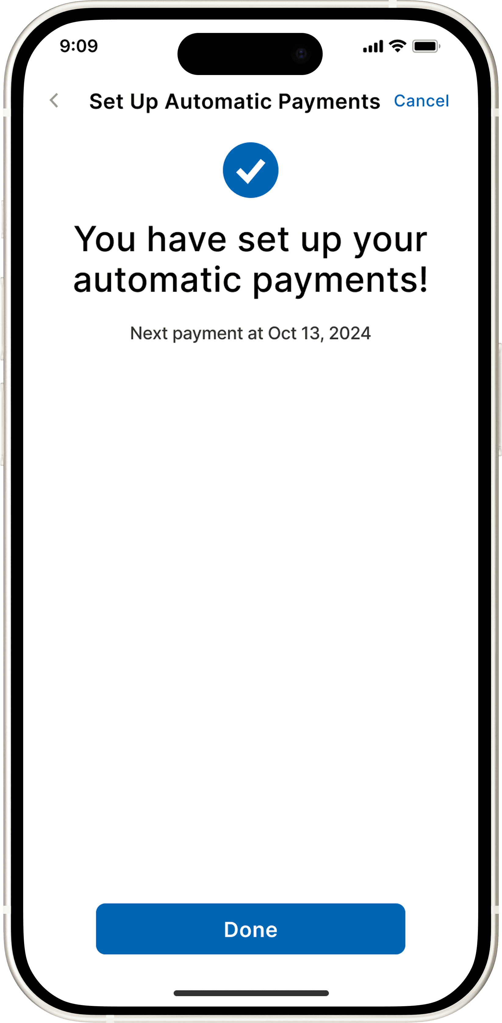
Clear Auto Pay Confirmation
After setting up Auto Pay, users are immediately shown a simple, reassuring confirmation message. This screen clearly confirms that Auto Pay is active and displays the exact date of the next scheduled payment, giving users peace of mind and a clear next step.
After setting up Auto Pay, users are immediately shown a simple, reassuring confirmation message. This screen clearly confirms that Auto Pay is active and displays the exact date of the next scheduled payment, giving users peace of mind and a clear next step.

Home Screen Auto Pay Overview
The redesigned home screen lets users easily manage their Auto Pay directly from the credit card section. Key details—like the next scheduled Auto Pay date and payment amount—are now clearly displayed, eliminating guesswork and providing users with immediate confidence that everything is on track.
The redesigned home screen lets users easily manage their Auto Pay directly from the credit card section. Key details—like the next scheduled Auto Pay date and payment amount—are now clearly displayed, eliminating guesswork and providing users with immediate confidence that everything is on track.
Function Navigation
Impact & Reflection
This project taught me how small UX changes—like clearer flows and feedback—can build user trust. After testing the redesigned Auto Pay flow with 8 users, task completion rose from 25% to 100%, task completion time reduced by 70%, and confidence improved by 62%. It reinforced that good design means helping users feel clear, capable, and in control.
This project taught me how small UX changes—like clearer flows and feedback—can build user trust. After testing the redesigned Auto Pay flow with 8 users, task completion rose from 25% to 100%, task completion time reduced by 70%, and confidence improved by 62%. It reinforced that good design means helping users feel clear, capable, and in control.
This project taught me how small UX changes—like clearer flows and feedback—can build user trust. After testing the redesigned Auto Pay flow with 8 users, task completion rose from 25% to 100%, task completion time reduced by 70%, and confidence improved by 62%. It reinforced that good design means helping users feel clear, capable, and in control.


